Still Life Photo Evaluation Example
Still LifeMinimalist|FruitTableColor Harmony
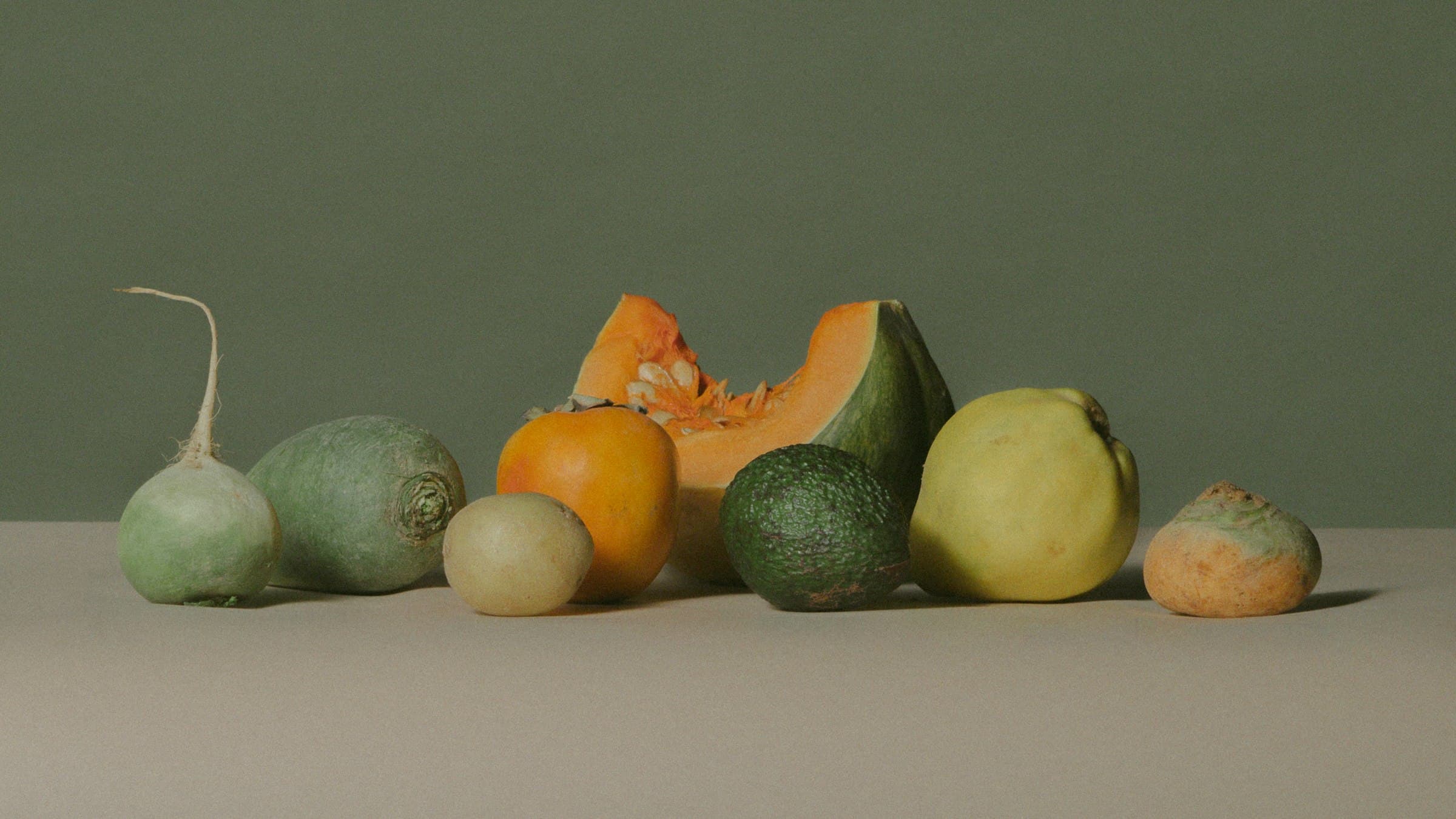
81/100
The arrangement lacks dynamism, with negative space underutilized, yet color harmony is commendable.
Effective use of harmonious earthy tones.
Underutilized negative space and lack of dynamic composition.
Category Breakdown
Negative space is present but inactive.
While there is ample negative space, it does not actively contribute to the composition. The space serves more as a background rather than an integral element, missing an opportunity to enhance the image's dynamism.
Overall Critique
The composition features a straightforward arrangement of fruits, lacking geometric sophistication. Negative space is present but does not actively contribute to the composition, resulting in a static feel. The color palette is well-considered, with harmonious earthy tones that complement each other effectively. Technically, the image is well-executed, with clean edges and appropriate exposure. However, the concept does not extend beyond a simple still life, lacking deeper philosophical or aesthetic intent. Overall, while the image is visually pleasing, it does not fully exploit the potential of minimalist photography.
Improvement Tips
Editing (Lightroom): To enhance the image, consider lifting the shadows slightly to reveal more detail in the darker areas. Use the HSL panel to subtly adjust the saturation of the earthy tones, ensuring they remain harmonious. Apply a slight vignette to draw focus towards the center, enhancing the composition's depth.
Next Session: Experiment with varied geometric arrangements to introduce dynamism and tension.
Reference Artist
Irving PennStill Life
Study Penn's work for sophisticated composition and use of negative space in still life.
Still LifeMinimalist|FruitTableColor Harmony
The arrangement lacks dynamism, with negative space underutilized, yet color harmony is commendable.
Strength: Effective use of harmonious earthy tones.
Limitation: Underutilized negative space and lack of dynamic composition.
81/100
Category Breakdown
Negative space is present but inactive.
While there is ample negative space, it does not actively contribute to the composition. The space serves more as a background rather than an integral element, missing an opportunity to enhance the image's dynamism.
Overall Critique
The composition features a straightforward arrangement of fruits, lacking geometric sophistication. Negative space is present but does not actively contribute to the composition, resulting in a static feel. The color palette is well-considered, with harmonious earthy tones that complement each other effectively. Technically, the image is well-executed, with clean edges and appropriate exposure. However, the concept does not extend beyond a simple still life, lacking deeper philosophical or aesthetic intent. Overall, while the image is visually pleasing, it does not fully exploit the potential of minimalist photography.
Improvement Tips
Editing (Lightroom): To enhance the image, consider lifting the shadows slightly to reveal more detail in the darker areas. Use the HSL panel to subtly adjust the saturation of the earthy tones, ensuring they remain harmonious. Apply a slight vignette to draw focus towards the center, enhancing the composition's depth.
Next Session: Experiment with varied geometric arrangements to introduce dynamism and tension.
Reference Artist
Irving PennStill Life
Study Penn's work for sophisticated composition and use of negative space in still life.